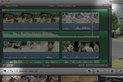
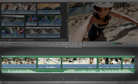
When the completely redesigned iMovie ’08 came out, a vocal group of users complained that the user interface didn’t include the traditional editing timeline. With Apple’s new iMovie ’11, however, a couple clicks bring the timeline back.
Apple touted the radical changes in iMovie ’08 as a way to make video editing more approachable to novices with little to no experience. They were right in that regard, but intermediate level users avoided it in favor of the pricier Final Cut Express or the older iMovie HD. The multi-line editing panel in the upper-left corner of iMovie ’08’s window was not as familiar to these folks as the single-line horizontal timeline they used for so long.
Now that iMovie ’11 is here, the updated iLife application offers the best of both worlds. The default user interface is the same, but more advanced users have the option to get their beloved timeline back with just two clicks.

The first step to enabling the traditional editing timeline in iMovie ’11 is to click the Single-Row View button in the upper-right corner of the Project Browser. Next, click the Swap Events and Projects button on the left side of the middle toolbar. Now the entire bottom half of the screen is utilized by the timeline.

Pretty easy, right? If you’re one of those who have avoided iMovie ’08 and iMovie ’09 for the past few years, this definitely makes iMovie ’11 worth checking out.


December 3rd, 2010, 5:59 PM
Finally – any news on plug-ins and effects? All the ones for iMovie HD were made instantly redundant when the new iMovie came out, and the supplied selection with the new version were anaemic at best. Have they added any more? Is Apple actually listening to its customers?
Cheers.