If you are perplexed as to why Mac OS X’s green Zoom button doesn’t always maximize windows to full screen like in Microsoft Windows, there’s a perfectly good explanation. In fact, it truly makes sense when you think about it.
As mentioned in MacYourself’s previous article, “Mac switchers: 7 Windows concepts & habits you need to let go,” the biggest hurdle many new Mac users face is their own frame of mind. Rather than trying to make Mac OS X work like Windows, the best approach is to start fresh and be open to different ways of doing things. The Windows-based habit of maximizing windows to fill the entire screen is just that – a concept from Windows. The Mac’s green Zoom button – called the plus (+) button by some – is meant to behave differently. And, even though it may seem erratic and random at times, there is usually a method to its madness.
Real world examples
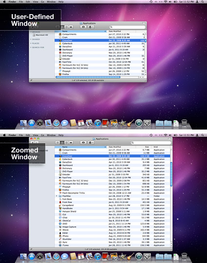
In order to best understand the green Zoom button found in the upper-left corner of each window, let’s study it’s behavior with a few different applications. In Finder, the Zoom button toggles between the small window size I set for myself and a tall window size Finder chose for me.

Why did the window get taller and slightly wider, but not quite full screen? Because there was enough content in the window to fill the screen vertically. Horizontally, there was nothing left to show other than white space – so Finder decided not to display it.
Now let’s look at Apple’s website in Safari. Notice the first image below is a very small window with both vertical and horizontal scrollbars. The second image shows what the window looks like after clicking the Zoom button. Again, it takes up all of the vertical space because there was more scrollable content to be seen. The third image illustrates what the screen would look like fully maximized Windows-style.

Notice the wasted blank space on both sides of the maximized window and how it serves no purpose? That’s why the Zoom button ignored that empty background. It analyzed the web page I was viewing at the time and sized the window to match its content. Try web pages with a different width and it will size the window differently each time, depending on what’s on screen.
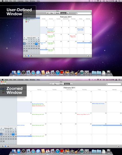
Of course, there are a number of applications in Mac OS X that appear to go full screen when the Zoom button is clicked. Mail, iCal, and iPhoto (among others) can be “maximized”, for example. Isn’t that inconsistent with the two cases shown above? Actually, quite the opposite. iPhoto can display more images at once when the window gets bigger, so there is enough content to justify filling the screen in all directions. The same goes for iCal – it can show the entire month’s view and give each day a bigger space to fit its events. There are functional reasons for blowing the window up to that large of a size and the Zoom button is intelligent enough to determine when and when not to do it.

Modern concepts
The idea of maximizing windows might have been a good one back in the day when monitors could only display a small 800×600 pixels. Now that we have high resolution widescreen displays, however, making every window full screen no longer makes sense. It will usually result in wasted screen space that could otherwise be used to show more content at once. For instance, you could have your iChat buddy list and a chat window open alongside Safari as you browse. If Safari was maximized, you’d have to manually switch back and forth between the two applications to check your updated buddy list and read new IM’s.
But what about those who prefer to maximize their applications so they can focus on the content without distraction? Rather than making the window bigger and covering background windows with useless empty space, Mac OS X has a handy feature called “Hide Others.” Just press Cmd+Option+H on the keyboard or hold the Option key, right click on your current app’s Dock icon, and select “Hide Others” from the menu. Now all you’ll see is the window you want to work with while the others are hidden from view – no clutter and no unnecessary wasted space.


August 10th, 2014, 9:35 AM
When working with Windows on a 4 megapixel display, every time I open an application, I have to manually re-size the window to match the content so I can reference the content in multiple windows without having to open/close, move, select etc. to display what I need to see. The purpose of multiple concurrent windows, is referencing data from N number of places, without having to constantly move / size windows to see the information you need.
Productivity on people a Window box is a fraction of people on OS X. Part of this is window management, along with consistent menus, less wasted real estate on menus that are not active when windows are inactive, and many other factors.
The competing theory goes beyond window management; look at Outlook, where everything – calendar, contacts, email – is contained in a single window. OS X has mail, contacts and calendar as separate, but tightly coupled applications.
Which may also be why all studies of Mac vs. PC usage, shows that Mac users use an average of 3 times as many applications as their Windows counterparts (because it is easy?), and require less than 20% of the IT support resource.
Did a study years ago for the Defense Department on user productivity on computers, evaluation disk speed, processor speed, amount of memory, and screen size, as competing factors. For the overwhelming majority of users, productivity was enhanced by having more screen real estate, by a factor of 2 to 1 over any of the other factors. But this was based on work over the course of a day, where multiple applications are opened, and interaction between the content was required, not a role that is solely focused on a single function, like Photoshop or CAD, etc.